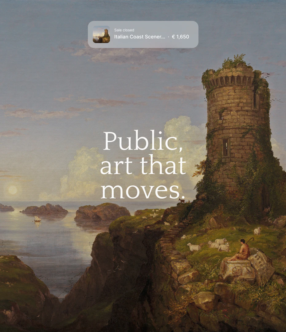
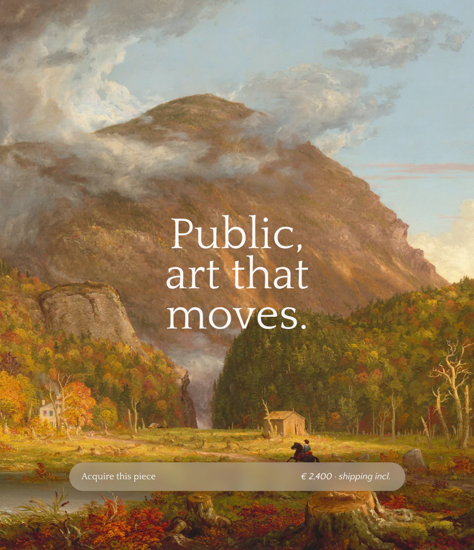
Public, art that moves.
Identity, art direction, and product for a contemporary art auction platform. From typography to the online catalog, a system designed to let the artworks breathe.
The question
Public is a platform for buying contemporary art at auction. Almost everything a visitor sees there is somebody else's work. So the question was simple. How much should the brand say, and when should it get out of the way?
The idea
We made a system that steps back so the art can breathe: one serif, a lot of white space, thin outlines. The paintings fill the frame and do the talking. The brand only speaks up where it's useful, to tell you what a piece is, what it costs and whether you can still have it.
The mark
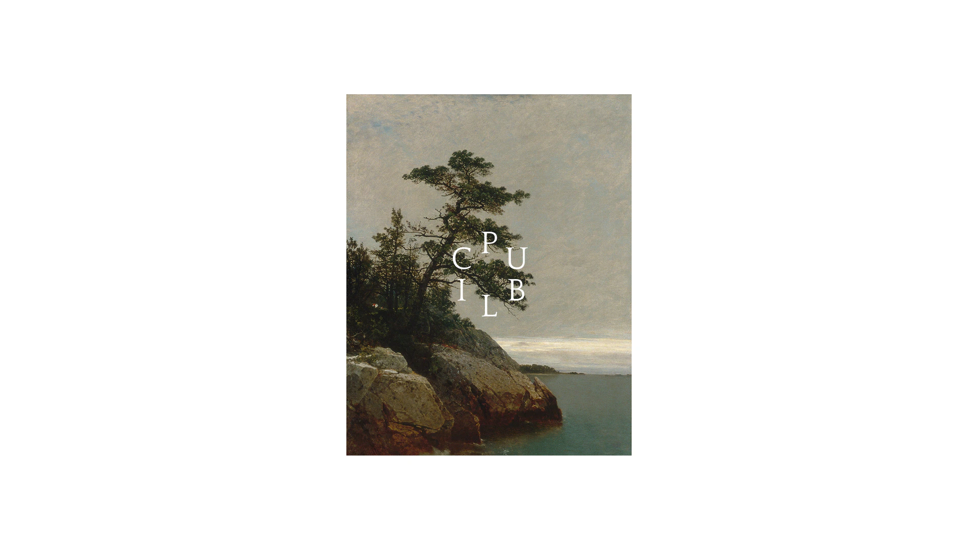
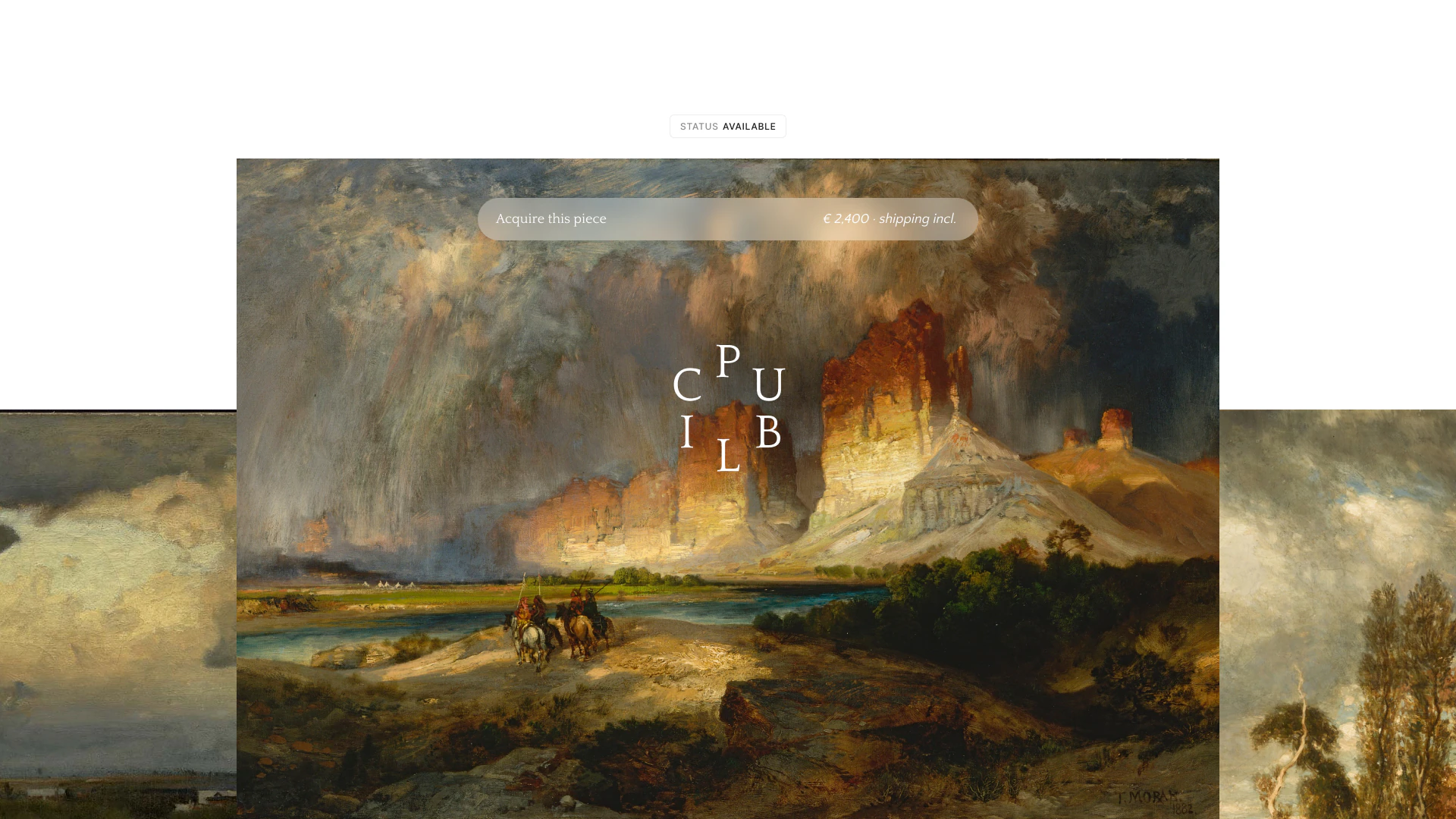
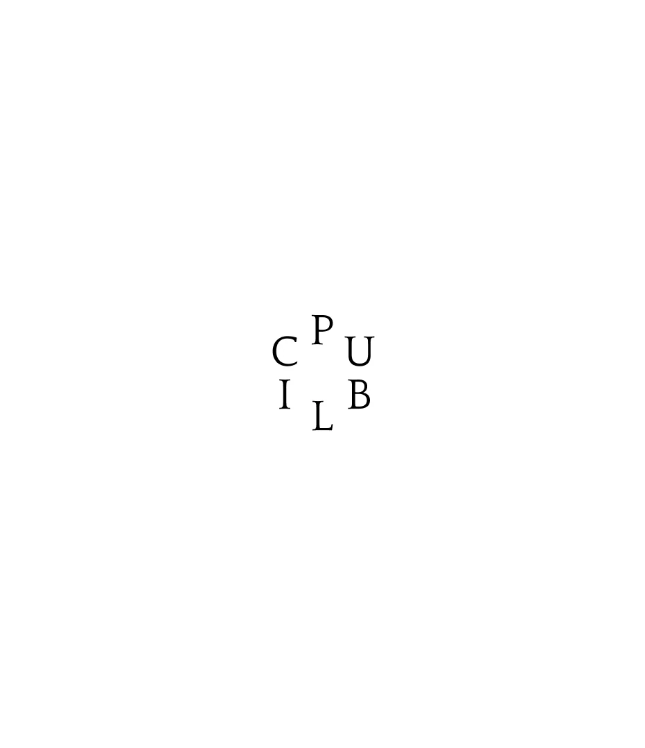
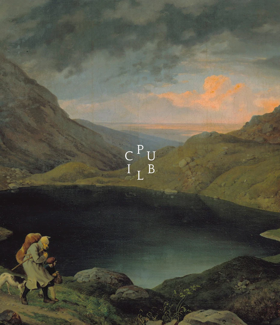
The logo is the word Public taken apart. Its six letters sit in a small ring, P at the top and the rest following around the circle. In white, it lands on a sky or a cliff like a stamp, light enough to sit on a painting without covering it.
For motion we pulled the letters back out of the ring. In a short loop they take turns filling the whole frame, large and white, with a landscape showing through around them. One letter at a time.
The product
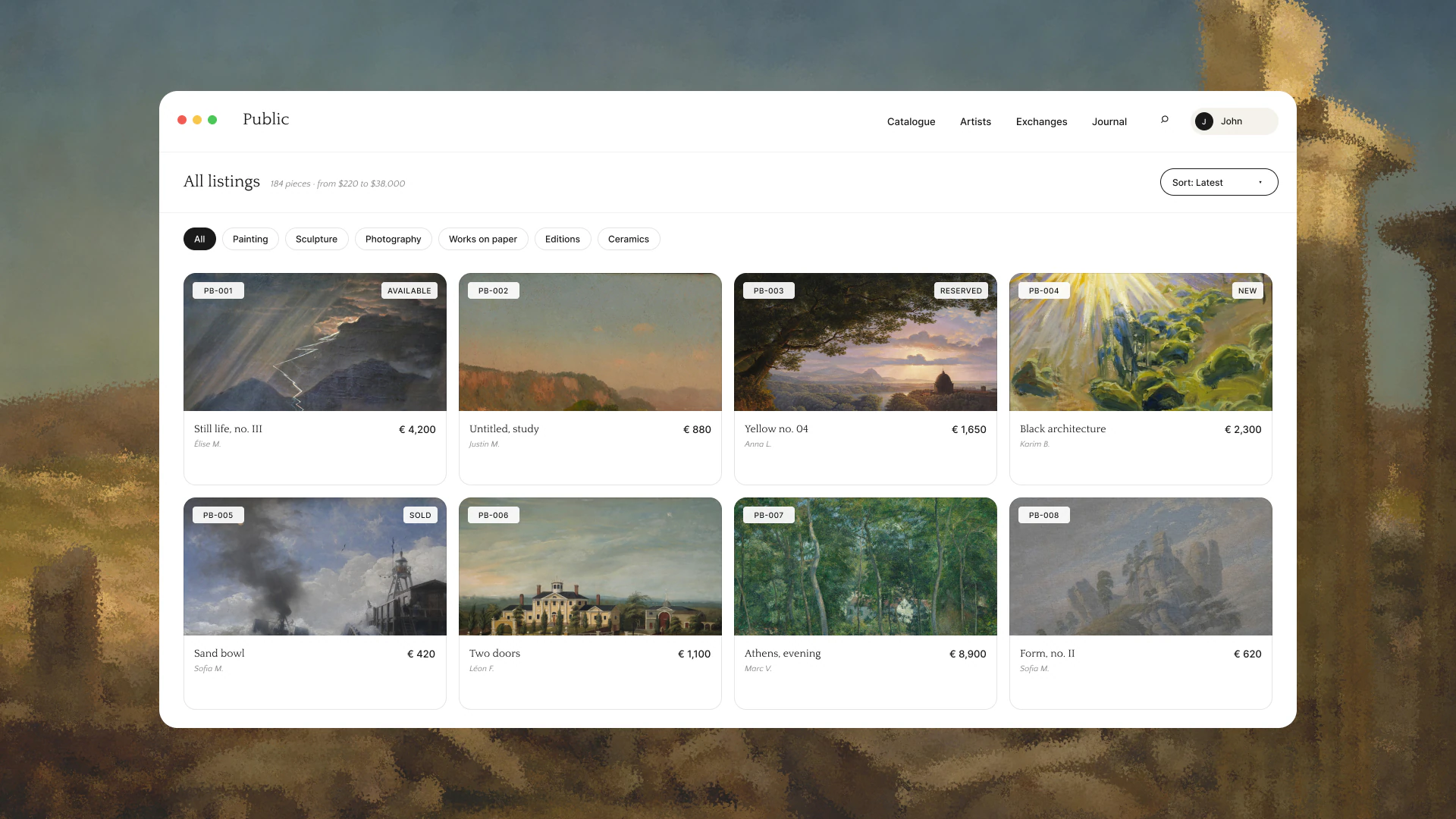
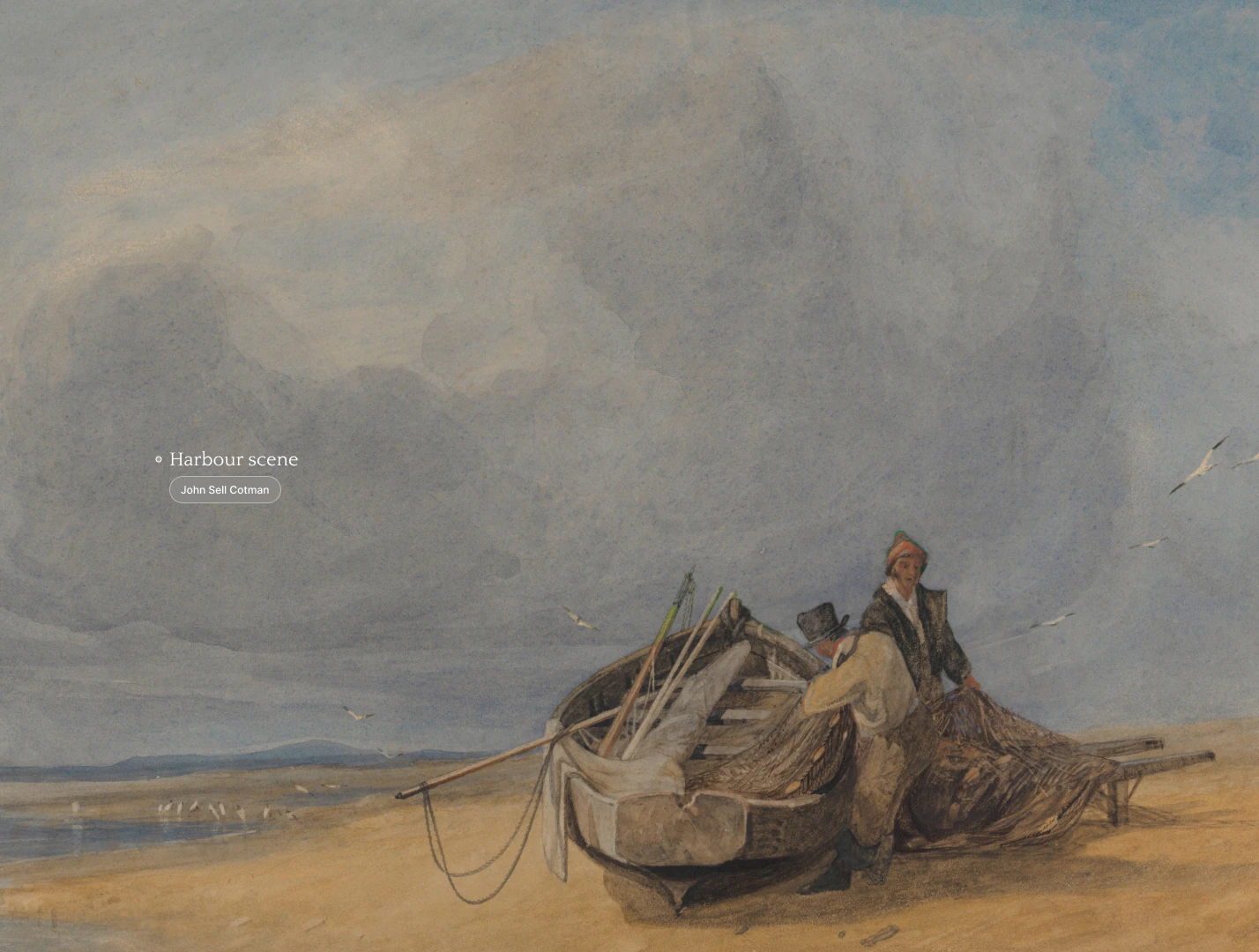
The catalogue opens on "All listings", with filters as simple pills. Each card carries a lot number like PB-001 in one corner and a status in the other: available, reserved, new or sold. Below the image there's a title, an artist and a price. That's all. The picture gets most of the card.
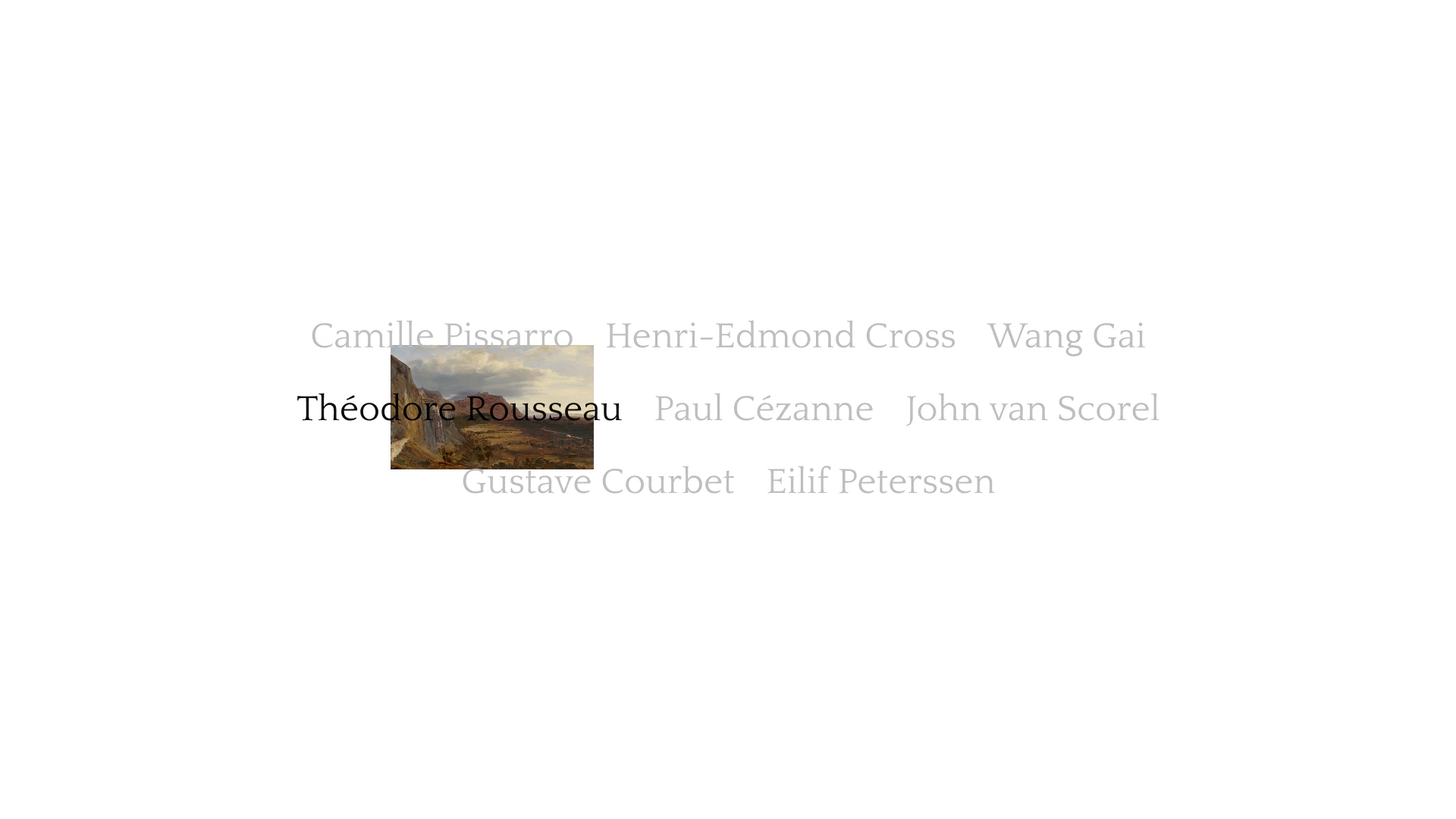
On the page for a single piece, the painting takes the whole screen. One soft bar floats over it and reads "Acquire this piece", with the price and shipping included. The artist index is a few lines of names in the serif, set in grey. The name you're on turns black and a painting appears beside it.
Identity, art direction and product are built from the same few pieces, and every screen asks the same thing of the brand: say what's needed, then step back.
Credits
Creative Direction
Drice Roland
Next
Cosmos · Visual discovery platform